


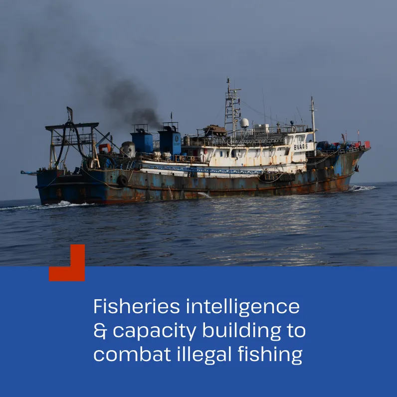
The brief
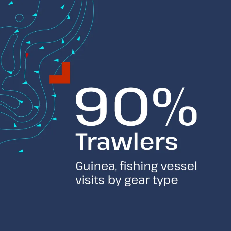
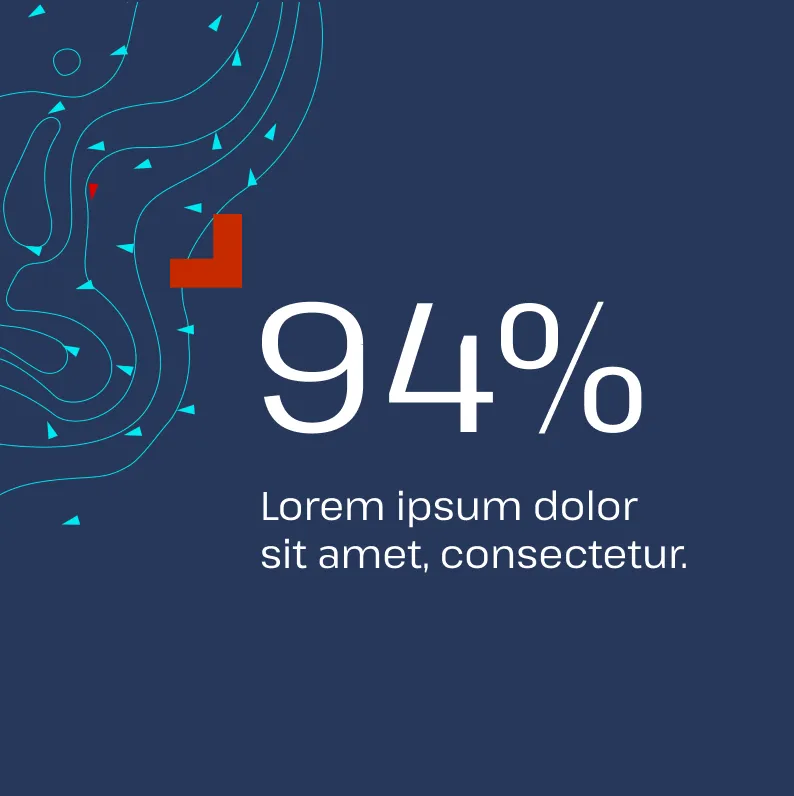
TMT asked us to help evolve and modernise their brand. Our research led us to take inspiration from the fishing/ocean visual lexicon using brighter colours to give communications extra visual impact, whilst also maintaining a sense of authority and continuity with the historical brand. Brand devices – contours and triangles – representing fishing boats are inspired by radar representation of ships and depth chart contours.
A robust logo that works at small sizes
The TMT logo appears in a wide variety of uses including embroidered polo shirts, in icon form on data visualisations, and in a variety of one colour uses. So we developed a robust logo that works well at the smallest sizes and maintains its meaning and clarity in one colour.


Larissa Clark
Communications, TMT


Larissa Clark
Communications, TMT


Designing guides, manuals and reports
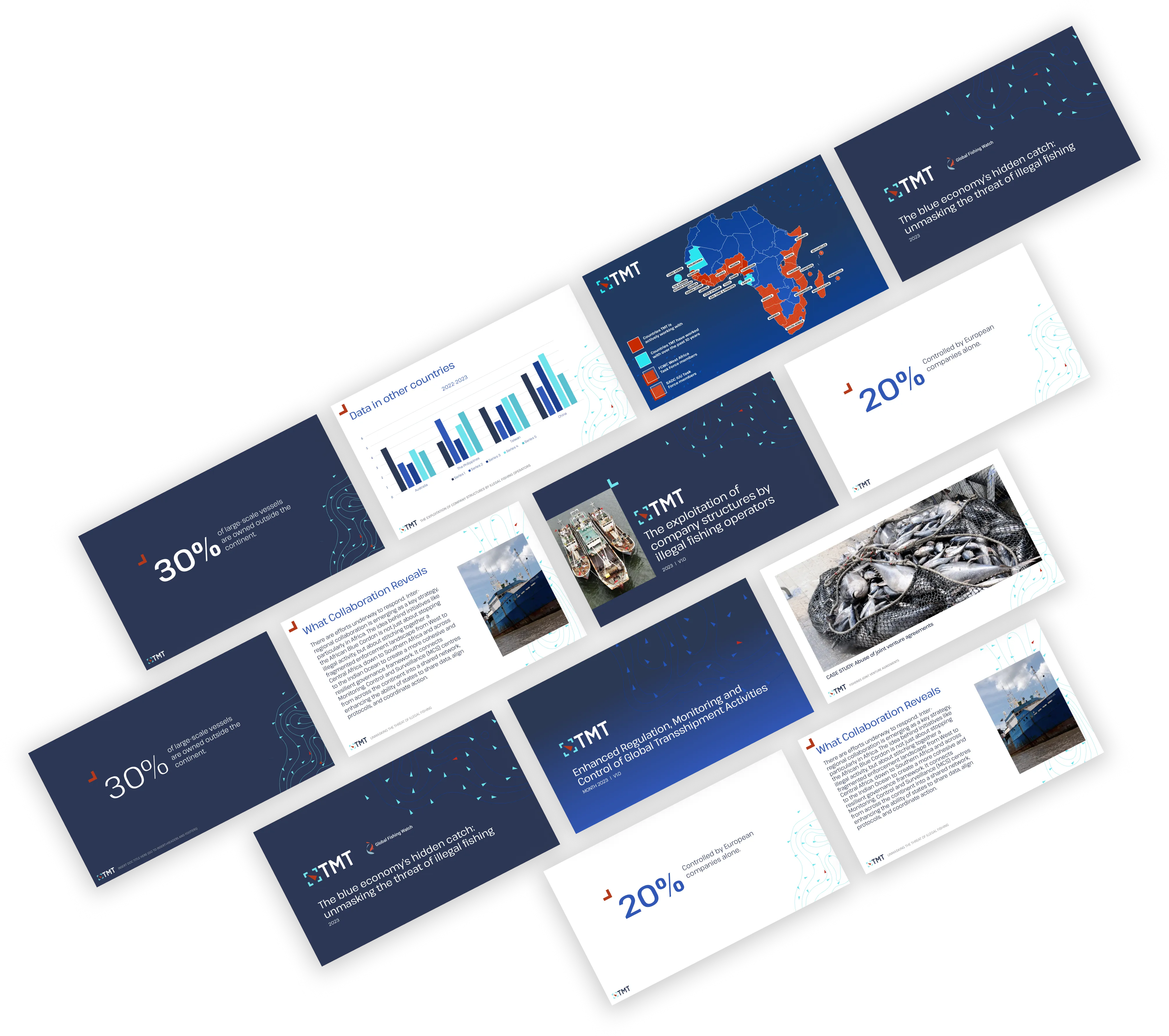
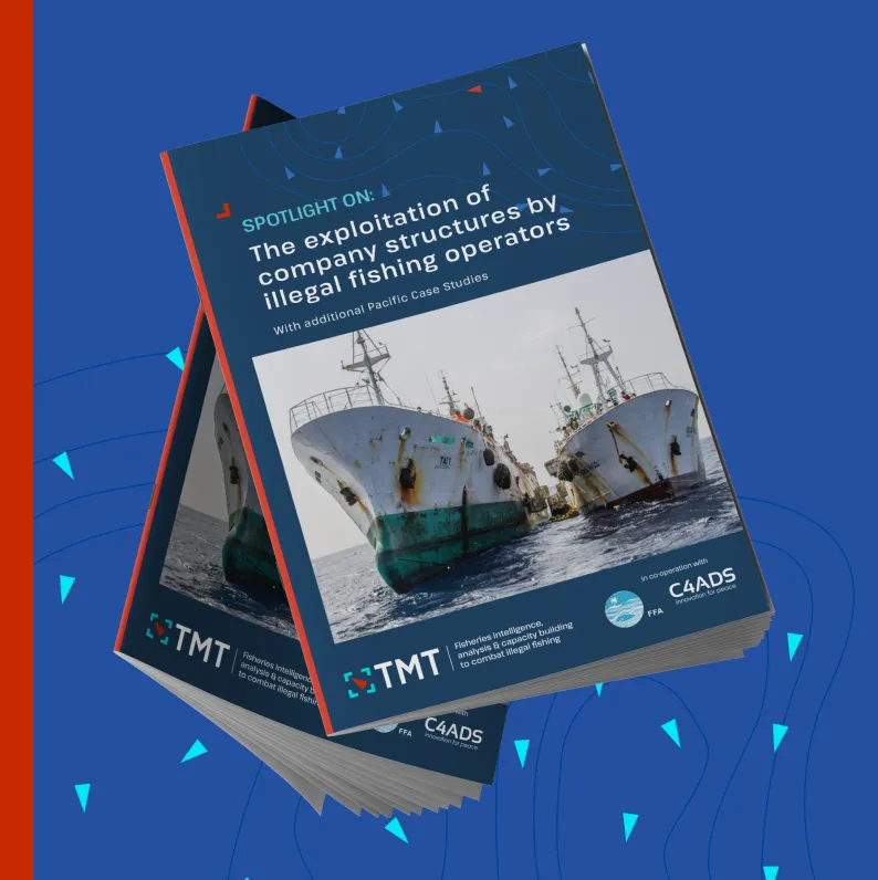
We’ve been working with TMT for many years producing insight reports and guides for their global monitoring and prevention initiatives. We typeset and create bespoke infographics Sometimes working with tight timescales and producing guides in multiple languages. With the rebrand we’ve been able to give the guides a smart new look.


